Central University Journal No. 46 (Offprint) February 5, 2025 On Hang Tam (Chinese Documentary Style Photography)— Akira Yamamoto日本中央大學山本明教授(譚昌恒論)
-
Published27 Mar 2026
-
Author
Central University Journal No. 46 (Offprint) February 5, 2025 On Hang Tam —The Phase of Linear Archive Art in Post-"Documentary Photography" (Chinese Documentary Style Photography)— Akira Yamamoto (Handwritten Notes): Top Right: To Mr. Hang Tam
Central University Journal No. 46 (Offprint) February 5, 2025
On Hang Tam
—The Phase of Linear Archive Art in Post-"Documentary Photography" (Chinese Documentary Style Photography)—
Akira Yamamoto
(Handwritten Notes):
Top Right: To Mr. Hang Tam
Center: For your kind critique and correction
Bottom Left: March 14th, Year of the Wood Snake (Yi-Si), Akira Yamamoto (Seal)
Image 02: Page 49
Central University Journal No. 46, February 2025
On Hang Tam
—The Phase of Linear Archive Art in Post-"Documentary Photography" (Chinese Documentary Style Photography)—
Akira Yamamoto
"I began to understand that this place hasn't changed in essence. (...) What is called an ending is presented precisely for a new beginning."
——Hang Tam, A Certain Shutter ¹⁾
Introduction
It is precisely because there are no photographs that memories are carved more deeply. If those involuntarily flashing fragments of images are called "photographs," and if these are not just personal but also "photographs" of collective memory, how then are "photographs" shaped through language and imagery?
"Sacred and strange images flash suddenly in the mind." "Against the deep blue sky hangs a golden full moon, and on the sandy ground by the sea is an endless green watermelon patch. A twelve-year-old child wearing a silver necklace raises a pitchfork toward an imaginary animal called a 'Zha' (猹)." This is a place conjured by fictional image fragments reassembled from diverse colors. Although described from the same angle, the child and the fragments of the Zha vanish in the final image ²⁾. These are the "photographs" in Lu Xun’s novella My Old Home. Between these two images, the fragments of the proper nouns Runtu and Yang Ersao, along with the shifting of past memories, are interspersed with present scenes.
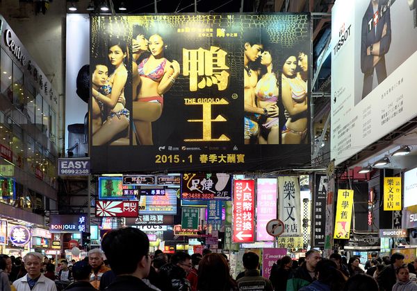
Under the title Neon Lighted Nathan Road, Kowloon, a postcard from 1972 appears at the beginning, while the end shows today’s main road, desolate after the neon signs have been removed. Between these two images lie six pages of laminated sheets. Each leaf contains three neon signs, where only the glowing portions of proper nouns have been cropped, stripped from their original locations, and collaged in the air. Through the transparent plastic sheets, in a place that should be empty, the excessive light of 18 neon signs conjures an unsettling space. On the reverse side, the same neon signs are presented as out-of-focus or blurred images. Consequently, with every turn of the page, "Glittering Hong Kong" gradually disappears, eventually shaping the process by which all 18 neon fragments vanish. This is Hang Tam’s photobook Time have changed ³⁾. Walter Benjamin once read the proper nouns moored in the harbor... (continued)
Image 03: Page 50
...and felt the love and beauty bestowed upon those names; Barthes praised Proust’s style, filled with proper nouns, as "precious items compressed with fragrance that must be made to bloom like flowers," calling it the "linguistic form of involuntary memory" ⁴⁾. Within the old neon lights moored by lamination, each one contains entrusted emotions. But those emotions are not limited to the individual shop owner; they are the accumulation of collective thoughts of a brand—the beauty of Hong Kong's collective desire or spontaneous energy. For residents, every proper noun is a landmark of daily life, a trigger to unlock memories of events that occurred beneath them. Readers immerse themselves in the process of these neon lights fading as they turn the pages. This process is repeated in Sai Yeung Choi Street, which shares a similarly symbolic neon space, and is shaped through a collage of linguistic fragments in the overall composition of the photobook.
This is not a tourist postcard steeped in exoticism; it is not the "external gaze." It is not, as some previous visual works suggest, that "Hong Kong is merely a long transition, a hotel room" ⁵⁾—the gaze of an immigrant. Hang Tam repeatedly heterogenizes these perspectives, expressing the changes etched into his bones as someone born and raised in Hong Kong. In other words, it is an "internal gaze."
By collecting fragments of the skin between reality and fiction and reconstructing vibrant yet unsettling images, he expresses the collective memory of My Old Home through the dynamics of change. If Lu Xun achieved this through language, it can be said that Hang Tam shapes it through the reciprocating movement between photography and language.
Archive Art is defined as "using existing texts, images, or objects to present similar items in a linked, parallel serialized format (...), and through the manipulation and alteration of these contents, attempting to create an alternative or counter-memory different from historical information or common sense" ⁶⁾. If this is true, it can be said that Hang Tam is the one cutting through the context of Hong Kong's landscape within Archive Art.
The purpose of this paper is, firstly, to examine the stylistic changes between his debut in 2012, through the publication of seven physical photobooks and three e-books, up until Time have changed in 2021, and to evaluate the expressive value of the style that creates "photographs" within the bound photobook, which inherently possesses linearity. Simultaneously, as the theme progresses from collective memory to extremely private memory in the 2022 work It's really is Kwun Tong, this paper evaluates the evolution into spatial archive art, where fragments such as photos and data from 40 years ago and current photos are stored in a canister.
The year 2012, when Hang Tam began his activities, was a turning point for Hong Kong. First was the struggle between collective memories; second was the struggle between visual styles.
First, in the summer of 2012, a movement was launched against the introduction of the "Moral and National Education" subject, which was withdrawn in September. When Hong Kong's Asia Television (ATV) labeled the opposition movement as "destructive," it faced a surge of citizen protests and a warning from the Communications Authority. The Chinese government attempted to introduce a narrative for forming national consciousness to overwrite collective memory—this was national education. It was a year when local thought—the identity of Hong Kong—was re-intellectualized in opposition. In other words, it was a battle between the collective memories of China and Hong Kong.
Image 04: Page 51
Second, in October of the same year, the Hong Kong International Photo Festival was held. Just as the 2010 exhibition catalog was titled City Flâneur: Social Documentary Photography ⁷⁾, it included street photography, social documentary, new topographics, and conceptual photography, but these were ultimately just synchronic classifications. However, in 2012, visual styles were categorized from a diachronic perspective: the first generation being those born in the Mainland who moved to post-war Hong Kong and focused on salon photography; the second generation being those born post-war who opposed salon photography and focused on straight photography; and the third generation defined as those born after 1976 who viewed photography as just one of many artistic tools. In other words, Hong Kong’s identity was defined through diachronic memory, with "Post-Straight Photography" as the theme to define visual style. In this sense, it was a turning point where collective memory and visual style merged.
Born in 1978, Hang Tam studied documentary photography and confessed it had the deepest influence on him ⁸⁾. However, he eventually moved toward diverse experiments in visualizing Hong Kong's collective memory. With the metamorphosis of Hong Kong as his theme, he arrived at the alchemy of transforming photographs as records into "photographs" as memory.
The second purpose of this paper is to evaluate the innovation of visual style within documentary photography and to explore the role played by the reciprocating relationship between linguistic style innovation and imagery in this series of studies ⁹⁾. The author attempts to propose Hang Tam’s style, which achieves "photographs" through the reciprocating movement of language and images, as a classic example of "Post-Documentary Photography."
1. The Phase of Neon Light Motifs
"I barely made it," "I just caught it"... (continued)
Here is the direct English translation for the remaining images (05 to 17), maintaining the formal academic tone and specific terminology from the original text.
Image 05: Page 52
...As mentioned in photobooks with neon themes (e.g., NEON NEON published in Japan, 2021), the decline of neon is a global phenomenon due to the rise of LEDs or the closure of shops. Of course, neon museums exist in Los Angeles, Las Vegas, and Warsaw, and Hong Kong’s visual culture museum "M+" has been collecting and displaying past neon signs since the 1980s; neon has long been a standardized presence as cultural heritage, art, and a motif in photography and film.
"The regulation banning large neon signs was implemented about 10 years ago, but when I started writing the script (2018—Yamamoto’s note), the removal work was at its peak; they were truly disappearing one after another. Therefore, a few years before formal filming began, I walked the streets with the photographer and took photos of neon." "This is the place where the movie Ghost in the Shell (2017) was filmed. Although many signs were removed after that, even more vanished after this photo was taken in 2018." In Hong Kong, since the 2010 amendment of the building laws, it is said that over 90% of neon signs vanished by 2020. This sense of crisis peaked around 2018 and became a poignant consensus. The urgency to commemorate neon as culture can be felt just from the titles of photobooks, films, research books, and special exhibitions published worldwide.
(List of titles: NEONSIGNS. HK, Neon Literature, Darkened Neon, TO: KY: OO, Looking at Hong Kong Street Signs, NEON NEON, Time have changed, AFTER DARK, A Light Never Goes Out, The Fading Neon Lights).
Among these, Hong Kong neon was popularized by neon craftsmen who fled the Mainland during the Sino-Japanese War or after the liberation, flourished with high economic growth, and became a Hong Kong-style image. Neon symbolizes the free display of immigrant identity, desire, and vitality, as well as the decline caused by government regulations. In other words, it is the collective memory of Hong Kong itself. In the face of these vast standardized examples, what possibilities did Hang Tam open up?
1-1 Previous Cases of Neon Visual Style
The visual style of neon can be analyzed through the multiplication of "types of neon fragmentation" and "types of structural principles," combined with black-and-white or color presentation.
Regarding types of fragmentation, Type 1 does not fragment it but captures the entire space where neon lights cluster. Since the 1930s "Devil’s Capital" Shanghai motifs, this has been a standardized composition; if primary colors like artificial sweeteners or nostalgic colors are added, it becomes a Hong Kong tourist postcard. This is an "external gaze." Type 2 fragments the entire busy street into individual shops, capturing only the facade and its neon signs as specimens. Type 3 captures only a part of the neon sign to heterogenize it. As the extreme of fragmentation... (continued)
Image 06: Page 53
...Objectification. Type 4 captures the neon colors reflected in puddles, window glass, or car windshields. This is a "Cyberpunk" type with dissolving outlines. Type 5 captures neon signs exposed to sunlight, like objects after magic has vanished. This is the gaze of "Modernology."
Regarding composition, there are "Diachronic Comparison" and "Synchronic Comparison." Combining "Diachronic Comparison" with "Type 1" results in the "Before and After" style. For example, placing a 1961 panoramic photo of Nathan Road on the left page and a photo of almost the same spot from the same angle today on the right. In the past image, countless neon signs extend horizontally from the buildings on the right; in contrast, those neon signs have been removed in the current image, and signs on the left are covered by bamboo scaffolding, showing them in the process of removal. This is Vaughan Grylls’ photobook Hong Kong: Then and Now. He gives the following value to this "Before and After" style: "The process of change cannot be settled by simply comparing 'past' and 'present' at a certain moment; it must be captured by the historical flow of accumulating multiple 'pasts.' There are almost no commonalities between photos of the past and present. Sometimes nothing but the terrain is common; sometimes the 'remnants of the past' can only be felt in a tiny part of a building or garden. However, what makes Hong Kong is the people living there; through the energy they radiate, the city survives. I tried to extract fragments of that energy from 'past' photos into 'present' photos."
However, Grylls did not insert multiple "pasts" to create a historical flow. Consequently, the caption for the current image reads: "None of the things that appeared in the 1961 photo remain" (...). Even so, some things do not change. He mentions that "the bamboo scaffolding common at street construction sites is reminiscent of ancient times." This "external gaze" seeking Hong Kong-style energy eventually falls into the gravitational pull of exoticism through the bamboo scaffolding.
Time have changed also contains two sets of "Before and After" modules. However, between the two past and present images, 18 neon signs that should not exist there are implanted, conjuring a fictional garden where flowers gradually vanish with the turn of the page, as mentioned before.
Type 2 expresses the original function of neon signs. By capturing the shop design, people entering and exiting, and the atmosphere of the place, the shop's personality appears as a whole. Combining "Type 2" with diachronic comparison and the reciprocating movement of images and language results in the film A Light Never Goes Out. The film focuses on the historically significant "Tsui Wah Restaurant," placing the scene where the giant, tombstone-like neon sign is lowered to the ground while still lit at 23:00 on August 15, 2020, at the beginning. Under the viewer's gaze, the place becomes a solemn ritual space, visualizing the shop's historical personality and public memory. Voiceovers like "Decades of history vanished" and "In the blink of an eye" are overlapped. Precisely because it is a film, it can visualize the "blink of an eye," the moment of change.
Of course, "Type 1 combined with diachronic comparison" is also repeatedly used in the film. By seamlessly connecting the panoramic views of the busy street before and after the removal of neon signs at the same spot and angle, the contrast of images is achieved. Voiceovers like "This street used to be full of neon," "It was bright even late at night," and "No trace is left" reinforce the contrast through language. However, the more the focus on an individual neon sign is strengthened, the more the individuality and memory are reinforced. Therefore, Type 2 is placed at the beginning of the work.
Image 07: Page 54
Different from the "external gaze" of tourist postcards, this presents a strange nostalgia. However, director Anastasia Tsang, who studied film at the Sorbonne, planned a film themed on "Grief"; "these were elements that felt like Hong Kong film style," and through searching for these elements, she discovered neon after the fact. This is also an "external gaze." Meanwhile, the film title A Light Never Goes Out corresponds to Xin Qiji’s poem The Lantern Festival, "Searching for her thousands of times in the crowd, suddenly looking back, she is there, where the lights are dim." While colorful lanterns light the streets to celebrate the Lantern Festival, that person is found where the lights are sparse. In other words, in the crisis of the Southern Song dynasty being suppressed by the Jin Kingdom, it expresses the self-preserving integrity against politicians indulging in pleasure, using it to express an unconventional feminine color. In the context of government regulations removing neon and the death of a neon craftsman husband, traditional aesthetics of integrity and grief are summoned to express the wife’s wish to protect the neon.
In the works uploaded to Hang Tam’s Instagram (hereafter IG), Type 2 also exists. Multiple neon signs of "Tsui Wah Restaurant," like tombstones, are positioned at the top of the frame, creating a presence that overlooks the busy street. But in Time have changed, the neon signs are cropped like rubbings and laminated. This is common to other Type 2 examples; it is not an exception.
For example, "Lin Heung Tea House," founded in 1927 with a commoner and nostalgic atmosphere, used for the In the Mood for Love press conference. The same composition is adopted in the Mainland Wikipedia or the M+ neon archive. At the intersection... (continued)
The angle that equally positions the front and side of the shop allows two neon signs on each side to enter the frame, with people waiting to enter and the bustle positioned below. Hang Tam also adopts this standardized composition on IG. However, in the laminated pages of Time have changed, only fragmented neon signs are floating. This can be described as a fragmentation to reset "socially shared images (social public images)."
Type 3 fragmentation progresses to the components of neon signs. Neon signs are no longer just shop signs but are objectified. Neon signs possess an Aura born from the craftsman's personality. Therefore, personal style penetrates the details. This is because they hide the power to become an Object. Tsubasa Fujikura, in Neon Sign (2021), takes extreme close-ups of neon signs, focusing on details to depict the 3D structure of neon tubes, wear from wind and rain, and color gradients. At that point, by framing only part of a character or pattern, morphological objectification is achieved.
Manson Lau, in SORRY (2022), creates alternative meanings by framing parts of neon signs like "SIN," "Snake," and "Freedom." This is objectification in the sense used by Winter Fuyu Yasunishi.
On Hang Tam’s IG, 15 examples of Type 3 are uploaded. In "Tsui Wah Restaurant," only the coffee cup pattern is taken; in "Parkview Hotel," only the moon and star pattern. Patterns of palm trees, sea turtles, deer, turtles, chickens, and mahjong tiles are also cropped as works.
Image 08: Page 55
Consequently, neon signs transcend being signs for shop names, goods, and services, becoming autonomous as folk-like virtual images similar to the Classic of Mountains and Seas. But in Time have changed, he only collages those five patterns from a postcard he made himself and puts them in an airmail envelope; they cannot be seen without opening it. Apart from that, Type 3 does not exist. For Hang Tam, the smallest unit of neon fragmentation seems to remain the proper noun.
Type 4 gives color to inorganic objects other than neon light, lighting up life. In terms of the dynamics of dissolving boundaries, it has the range of Cyberpunk. Among these, neon reflecting on surrounding glass and proliferating is standardized. For example, in Liam Wong’s TO: KY: OO, like red and green neon reflecting on a taxi windshield. Starting from his experience as a game developer and using anime as inspiration, he descended from virtual space to real space to begin photography. He uses photography to achieve vibrant colors and artificially constructed Cyberpunk background images. He describes his origin as: a taxi driver waiting for a couple to emerge from a Shinjuku love hotel in the rain. "That was my first experience capturing a 'Moment'." This is a static stance of aiming the lens from outside to inside the car, overlooking the balance of neon reflecting in, and pressing the shutter the moment the intended composition is complete.
On Hang Tam’s IG, there are also examples of neon reflecting on a minibus windshield. When included in Time have changed, he removed figures and backgrounds through real-scene trimming. On this basis, on glass that originally only reflected the neon of a pawnshop, he collaged over 30 neon signs. Like the laminated pages, he conjured a virtual garden on the glass. He positioned this work on the left side of a spread, and on the right page, reversed that reflected image, positioning it as a "real scene." The result is a sense of dynamics, as if the parked minibus is driving under neon lights.
Hang Tam, as a driver, continues to take photos from the driver's seat. In fact, before the minibus work, there were works taken from inside a car of neon reflecting on the windshield. Neon light turned into light trails, visualizing the speed of driving. This is, first and foremost, an "internal gaze," a dynamic stance visualizing irreversible passing from a moving viewpoint.
Type 5 is when the neon bodies that have lost their light are exposed to daylight, foregrounding a sense of sorrow. Akasegawa Genpei once expressed the energy of signs stabbing the road and the fear of passing under them using hammer-shaped signs; this is a stance attempting to capture cultural structure through form rather than light and shadow.
In Hang Tam’s IG, Type 5 also exists in large numbers. Even for the daytime Tsui Wah Restaurant neon, he adopted a "Before and After" style with and without bamboo scaffolding. But in Time have changed, the only Type 5 adopted is in the final module of his own photographic work. On the bottom half of the left page is a daytime view of Hong Kong from a peak; on the bottom half of the right page is the night view from the same angle. Furthermore... (continued)
Image 09: Page 56
...Positioning a photo of the starry sky in the upper right half. Between these, a laminated page is inserted, with 5 neon signs collaged in the sky area. The front side is the night image, and the reverse is the daytime image. As a result, neon signs of Type 5 emerge over daytime Hong Kong, while night neon emerges in the starry sky.
"While I lost the neon, I haven't seen the starlight yet. Sometimes circumstances are reversed; there's no starry sky, and no neon. Time keeps moving; I can only sigh." Hang Tam explains the meaning of the photobook title through the disappearance of both neon and starlight. However, this does not settle into despair. The neon fragments dotted in the starry sky are reclaimed through "sacred and strange" images. Type 5 only functions as a contrast to create the nighttime neon garden.
As stated above, Time have changed includes all fragments of the 5 types. Its historical value is manifested in this uncompromising reconstruction method.
Linking these 5 types with synchronic comparison allows for the derivation of regional characteristics or pan-temporal qualities. Liam Wong places Tsui Wah’s neon and Tsutenkaku’s Hitachi neon on opposite pages. Both occupy two-thirds of the vertical frame. Hitachi’s neon symbolizes the growth period described as "no longer post-war," while Tsui Wah’s neon symbolizes Hong Kong’s growth in the 80s. Both mix Roman letters, Kanji, Kana, etc., standing like giant tombstones. The original Tsutenkaku design placed an Eiffel Tower on a triumphal arch; Tsui Wah’s design has Dorian grooves on the column and Corinthian motifs on the capital. By connecting such fusion-based stateless designs, a worldview like Blade Runner or Ghost in the Shell emerges across borders. Hypertrophied desire dissolves the boundary between inorganic matter and flesh and continues to proliferate; this is the standardized neon space in Cyberpunk.
Although Hang Tam has published e-books of Osaka, Thailand, and Taiwan, he does not juxtapose foreign neon; instead, he feels that even looking at Dotonbori’s neon is like "being in Sai Yeung Choi Street in Hong Kong." This is not an "external gaze" seeking the individuality of foreign neon. No matter which country's neon he sees, he falls into nostalgia for Hong Kong—the gravitational pull of memory; it is an "internal gaze." After publishing the Osaka photobook, choosing Sai Yeung Choi Street as the vessel for neon floral art in Time have changed is for the reasons mentioned above.
The photobooks by others mentioned above are all in color. However, Hang Tam, in the process toward Time have changed, experienced a change from B&W to color, while the ratio of the 5 fragmented types also changed.
The 2012 debut HONG KONG, being B&W, has many works where neon cannot be distinguished from regular signs; only 4 can be definitively called neon, 4.1% of 98 works. Type 3 did not yet exist. But one can already see the coexistence of sharp neon images from parked shooting and blurred images from driving. This can be called the prototype of laminating a sharp image and a blurred image of the same neon on front and back.
From 2016’s TV, everything became color, but there were no neon motifs. By 2019’s HONG KONG II, neon became color, and motifs increased to 8, 8.6% of 93 works.
Image 10: Page 57
...Although there are works with overlapping types, there are 3 cases of Type 1 and 2 cases of Type 2. While there are no works objectifying part of Type 3, there are 2 works with the neon sign itself as the subject, 2 cases of Type 4, and 1 case of Type 5. Neon motifs were not the theme of the photobook, and no type stood out. Notably, there were only 2 works that only close-upped a single neon sign and cropped the surroundings. Parts of other signs or light spots still remained. It can be confirmed that fragmentation by only cropping neon had not yet been completed as a conscious operation.
Finally, it should be noted that neon motifs were used for self-definition in the debut. In the selfie at the end of HONG KONG, he reflects himself with a camera in the center vertical window, with his exhibition history printed below and a neon sign positioned above. Indeed, Liam Wong’s selfie also positions the neon "Cyber Kowloon Walled City" above and his own upper body with a skull-like mask below. But Scottish-born Liam Wong set up a tripod and characterized himself, blending into the setting of a virtual chain store. This is the opposite of Hang Tam pressing the shutter on the streets of Hong Kong, his own roots, and expressing through the collage of language and neon images.
1-2 Previous Cases of Neon Linguistic Style
In the early stages of neon linguistic style, translations were not unified, but a similar context formed. Mao Dun’s Midnight (1933) wrote: "Looking west, what gives a sudden shock is the extraordinarily huge neon electric tube advertisement installed high on a foreign building, emitting fire-like red light and phosphor-like green flames: Light, Heat, Power!". Feng Zikai’s Commercial Art (1933) said: "Clear and strong neon lights (...) the more they pierce the eye and cause disgust, the greater the advertising effect." Lu Xun’s Snacks (1934) mentioned: "I think this is because neon electric light signs, a combination of Seal script and Roman letters, were installed on the shoulder poles." Translations wavered between "neon electric tube advertisement," "neon light," and "year-red electric light." However, as a symbol of foreign capital—the power company's "Power"—it occupies Shanghai with violent "Light," the giant neon "emits" light, and advertisements "pierce" people's eyes. Comparing popular short essays to superficial advertisements, neon was given negative connotations of capitalist aggression or falsity.
The reciprocating movement between language and images also cannot be confirmed. In the representative pictorial magazine The Young Companion (1926-45), usages of "year-red" and "rainbow light" are absent, and "neon" as an advertising light appears only 3 times. Like 1934 No. 85: "Under the light of the green neon advertisement, her eyes looked at the pitch-black sky," 1934 No. 99: "The neon lights dimmed, and the city's hustle gradually relaxed," 1940 No. 150: "Now the more anxious I am, the more I can't close my eyes. Flashing neon light, the shaking beard of Old An." Although visualizing urban hustle or anxiety, no illustrations or photos of neon exist there.
A turning point occurred in 1963. In the play Sentinels under Neon Lights, describing the PLA receiving Shanghai in 1949, neon appears as Hollywood movie ads, as a motif tempting female swimming teachers.
Image 11: Page 58
...It is a symbol of "Devil's Capital" Shanghai attempting to corrupt Communists. However, next to that neon, the neon for The White-Haired Girl was also shining. As stated in the play: "Neon lights flash on skyscrapers. The White-Haired Girl poster in neon and the American movie Bathing Beauty ad form a sharp contrast." Flashing neon became a platform for the binary opposition between American beauties in swimwear and suffering poor village women—the struggle between capitalism and communism. Finally, with the Korean War, neon of Communist slogans like "Long Live the PRC! Long Live Chairman Mao! lit the night sky." Neon was no longer a sign of urban consumerism but transformed into a weapon against the US, lighting the world with Maoism.
On the other hand, Hang Tam’s discourse on neon is neither a negative image nor a media image, nor even a standardized image in HK pop culture, but a trigger for recall deeply etched with his own memory. "And I can't think clearly about the driver with a camera. That monk appearing in the dead of night. Nightclubs under neon lights. This crying woman. The lying drunk man. The quadrangular desire state. The girlfriend in the nightclub. What was it that everyone met this night. Did the monk come to save the quadrangular lovers or has the monk not yet seen through the mortal world? Or did it bring a question-filled encounter for me to recall?". Within one sentence, the driver with a camera (himself), the monk, and the quadrangular relationship of men and women in the taxi are collaged together through punctuation. Neon space and characters are juxtaposed. Under neon light overflowing in the night, a monk appears, facing people boiling with desire; in the dark of the car, red neon light shoots in, lighting the lies a man tells his mistress.
Neon becomes a trigger to evoke and reconstruct event fragments. In HONG KONG, though a photo of a monk under neon is included, it is just a single work. The subsequent dialogue of the illicit couple or the events triggered, and feelings about them, were not expressed. Originally, filming the illicit couple in the backseat was impossible, and feelings couldn't be visualized. Until A Certain Shutter, he first described events in language, then published the monk's photo, and added a photo of another couple hugging on a street in a pleasure district. "Photographs" etched in memory, though impossible to take, are expressed through the reciprocating movement of language and photos.
Furthermore, not just the extinction, but the image of regeneration was already shown in A Certain Shutter. Placing 3 photos of two models in different clothes for Spring, Summer, Autumn, the 4th photo is of the shop after it closed and the models were removed. The images alone are just a grid of models, just the differentiation of the extinction process. But Hang Tam juxtaposed this discourse: "Shops have a commonality, that is, the shops that host them have a lot of neon light. Whether it's a pharmacy or an appliance store, it's the same. It feels like the kaleidoscope I saw as a child, always attractive." In this place, shops reincarnate from pharmacies to appliance stores according to customer needs. The commonality of reincarnated shops is plenty of neon. Hang Tam metaphors it as a kaleidoscope seen in childhood and gives it value as an attraction. Although individual brands vanish, neon continues to regenerate in a kaleidoscopic, dynamic, and lasting attraction, just as when neon was first born.
Image 12: Page 59
...(continued) Hang Tam captures neon through the image of "reincarnation" rather than extinction. This image connects with the postcard from a Mainland tourist at the end of Time have changed. The cyclic image from extinction to reincarnation is also structured in the overall composition of the photobook.
2. Linear Archive Art: Time have changed
Time have changed is a work collaging his own photos, past postcards, and text data. The following year's It's really is Kwun Tong is a collage of his own photos, his father's photos, text data, and maps; the two are consistent in reconstructing diverse fragments of past Hong Kong. However, while It's really is Kwun Tong places fragments in a canister for readers to pick randomly, creating a new composition each time, Time have changed is a bound work with an immutable composition. The process of turning pages generates meaning. This is why it is called "Linear Archive Art."
2-1 Structure of Time have changed
The fragments and structure of Time have changed are as follows: The signature and title simulate blue and red neon signs, "neonizing" himself. The title Time have changed is a common phrase in traditional Cantonese opera. Among the 11 works from 2012 HONG KONG to 2020 A Certain Shutter, no Cantonese titles appeared. But starting from Time have changed, to 2022 It's really is Kwun Tong, and 2024 Hello! Do you remember me?, titles shifted to Cantonese. Compared to A Light Never Goes Out summoning public memory in written Chinese, Hang Tam decided to stand on internal, daily, private memory.
First, it begins with the image module. Leaf 1 is a 1972 Nathan Road postcard with many neon signs; Leaf 8 is the current image with neon almost removed. Between them, from Leaf 2 to 7, laminated pages each containing 3 neon signs—18 in total—are inserted. On top of the "real scene," 18 neon signs grown elsewhere are collaged. Like Cubism, it assembles multi-perspective images in one frame, conjuring a neon garden (photograph) that photos cannot present. Then, the dynamics of neon vanishing are presented with the turn of pages.
Next is the language data module. Leaf 1 lists events for each month of 1972, each corresponding to a postmark. Below them is an essay. On the left side of the spread, Leaf 9 is in English; Leaf 10 on the right is in Chinese. Both are tracing paper, so "Time Have Changed" on the back of Leaf 8 and "Time have changed" on the front of Leaf 11 are visible through them.
Leaf 12 is a 1987 postcard to Italy, the image being the now-vanished giant neon structure—Jumbo Kingdom.
From the back of Leaf 14 to the front of Leaf 22, the same module structure as Leaf 1 back to Leaf 8 front is repeated. The place using neon as a floral vessel changes to "Sai Yeung Choi Street."
Leaf 23 is a 1997 postcard to Slovenia, a night view from the peak.
Leaf 24 front shows the work of neon light trails from a car; Leaf 24 back collages neon onto a minibus windshield where they didn't exist. Leaf 25 front adds the neon from Leaf 24 back to the main road scene. But compared to the same work on IG, neon proliferates further... (continued)
Image 13: Page 60
...Adding neon to the top and the vanishing point of the frame. Because brightness and saturation are increased, the result is a frame filled with excessive light, birthing an unstable "pseudo-scene." Moreover, by switching top neon and starlight, the starry sky on Leaf 27 front emerges, with neon and stars conjured simultaneously.
Leaf 25 back is a daytime bird's-eye view of HK Island and Kowloon. Leaf 27 front is the nighttime view, with a starry sky photo at the top. As mentioned before, by inserting laminated pages, he makes Type 5 neon emerge over daytime HK and night neon in the starry sky.
Leaf 28 is a 2017 postcard from a Mainland tourist from the peak to a home in Guilin, a collage of HK Island and Kowloon night views.
In summary, the work possesses these three stylistic characteristics:
It does not use just one of the 5 fragmented types but all of them.
It possesses two structural methods: a linear structure like a chronicle based on the half-century progress since the 1997 handover, and a cyclic structure of repeated neon generation and decay modules, the two being integrated.
It visualizes the above structure through language and images, performing a linear shaping of Hong Kong’s collective memory.
2-2 Reciprocating Movement of Language and Image in Time have changed
The linguistic style of the work shares the same structure as the visual style in terms of "fragmentation" and "synchronic/diachronic reconstruction."
Regarding the discourse on 1972 HK events, the author states it is cited from Wikipedia. 12 items are selected, one for each month, corresponding to the neon signs activated in the 12 laminated pages; readers can trace these symbolic lights.
Image 14: Page 61
...Although it lacks strictness due to the absence of access dates, the criteria for selecting items from the site can be summarized. 39 items were deleted, 10 items cited as-is, and 2 items added. All 33 deleted items were accidents or incidents. Major events that could happen in other years were deleted. On the other hand, selected fragments include: opening of HK’s first Cross-Harbour Tunnel, start of minibus operations, opening of Tai Kok Tsui Pier, opening of Kowloon Stock Exchange, transition of HKD from GBP peg to free float, then to USD peg, opening of HK Polytechnic.
The 1970s are semi-legendarily beautified by current HK citizens as the "nostalgic Golden Age." After Governor MacLehose took office in 1971, infrastructure improvement, compulsory education, public housing, labor laws, and the ICAC all began here. In this sense, 1972 is a symbolic year—the starting point of infrastructure supporting growth in transport, finance, and education. The tunnel, minibus network, and Polytechnic were all founded by the private sector, symbols of "spontaneous energy."
Furthermore, 1972 is a perfect year to show the change of half a century. Tai Kok Tsui Pier stopped due to West Kowloon reclamation in 1992; Kowloon Stock Exchange merged into SEHK in 1980 and HKEX in 2000; HK Polytechnic, having fulfilled its historical mission of training technical workers, became HK PolyU in 1994. Every proper noun is a vibrant neon sign radiating the energy of the Golden Age, which now shows that energy has worn out.
Additionally, the 2 (actually 3) items added by the author are the date Brian wrote the postcard and the death of Ip Man in December. Ip Man, who fled to HK in 1949, established and popularized Wing Chun, and was Bruce Lee’s master. He is a symbol of culture expelled from its motherland achieving local adaptation in HK and going global.
In the next year's It's really is Kwun Tong, the author cited the movie line "The Grandmaster" (about Ip Man). Ip Man is exactly a fragment symbolizing HK collective memory.
Image 15: Page 62
...(In-depth discussion on the term "Photography/Writing Truth")
In the creative process, "fragmentation"—cutting fragments from context—is emphasized first. As stated: "Most memories of me and my father are faded by time, leaving only scattered fragments, or maybe hidden in brain cells that are hard to find," by purifying scattered fragments, the power to evoke nostalgia and give imaginative strength is first obtained.
Secondly, the reciprocating movement of language and image is layered. As stated: "I have to try to recall the past from the depths of some memory cell in my brain; when a vague image comes to mind, I must record it with words first, then assist with photos, taking me to reconstruct an image," first a vague image fragment emerges, then recorded in language, and finally juxtaposed with photos; thus, "Photography (Writing Truth)" is first constructed.
Notably, whether it's the face of his father after death, the sky seen from the roadside when critically injured, or the emptiness after models vanished, the phrase "Only seeing" is used to lead the description. In A Certain Shutter, "Only seeing" appeared only 3 times, always when touching death or when a scene hit the eyes—the moment it transformed into "Photography."
This process of discarding the surface of representation and descending to the essence like Giacometti is Hang Tam’s unity of poem and painting. The core of this attitude is what "Post-Documentary Photography" demands.
Image 16: Page 63
...(Analysis of the photographer's style)
The author proposes the "Current" "Real Scene" and the "Memory" "Fictional Scene" as a binary opposition, defining the latter as "Pseudo-scene." On the other hand, precisely because it is a virtual "Photography" rather than reality, memory can sustain vitality "vividly" in the brain. Consequently, the author affirms the existence of "Pseudo-scenes" because they keep memory active.
In fact, the neon signs in Time have changed are not the real scenery before one's eyes. By cutting them from the background of past images and "objectifying" them, they are given "vivid" life and collaged in the brain.
Conclusion
"Photography" does not require refinement of material. Beyond the decay of neon, Hang Tam selected themes like shops reincarnating after models vanished and satellite waves reincarnating after wireless TV vanished. He chose a linear micro-analysis of the process from decay to change.
This "internal gaze" does not require unlimited digging for color. From HONG KONG to Time have changed, he constructed colorful pseudo-scenes, and in It's really is Kwun Tong, he moved away from pursuing color alone, evolving into a style mixing B&W and color.
The paper finally cites Mishima Yukio’s critique of "Tiger Balm Garden," pointing out that the folk-like, popular "brilliance" full of desire and energy is the commonality between HK neon space and the garden. Once wear appears, the process of death emerges.
Image 17: Page 64
...(Ending)
By "activating" neon signs full of signs of decline, the artificial dream—Time have changed—created through the reciprocating movement of language and image, can be called the final destination of visualizing HK’s collective memory in color.
"Today, we enter a post-human world. In this resistance, we must always remember that everyone exists and has a name." It is not the collective anonymity of "neon" from across history, but letting individual neon signs emerge, creating "Photography" that shines together like a starry sky.
Hang Tam is gradually breaking away from the linear gravitational pull of Boltanski-like discourse and image fragments, dispersing into 3D space. The stylistic analysis of "Spatial Archive Art" as a classic example of "Post-Documentary Photography" will be discussed next time.
(Acknowledgments omitted)