Memory Colors
-
Dates2025 - Ongoing
-
Author
- Location Chicago, United States
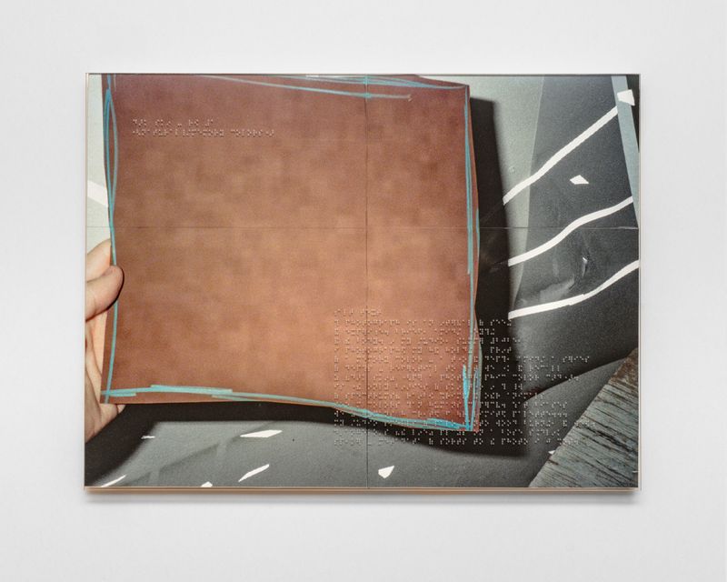
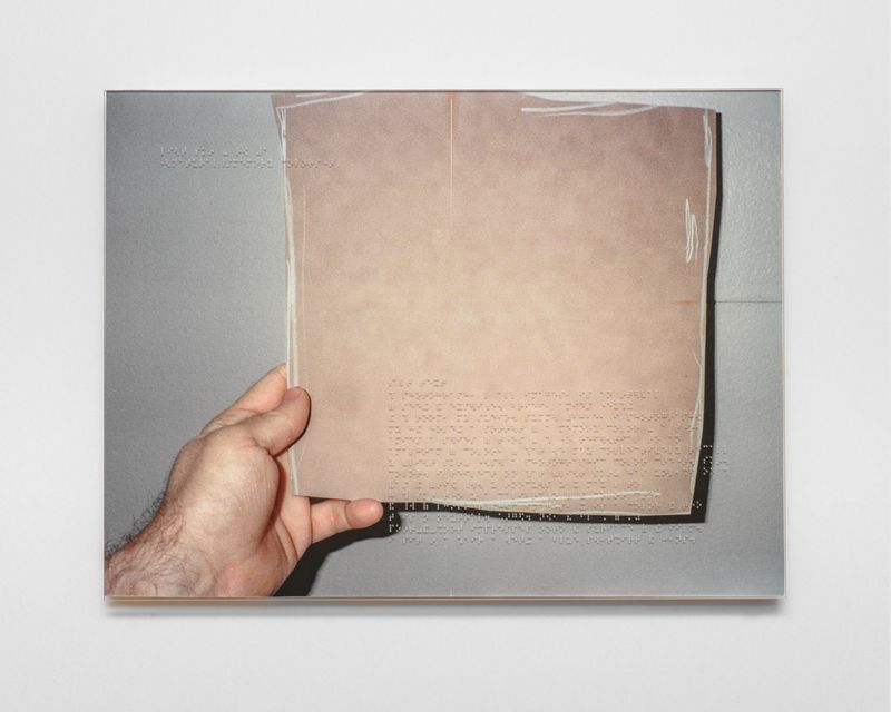
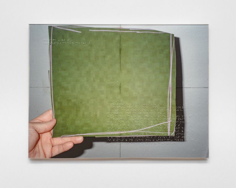
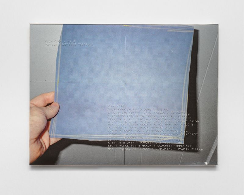
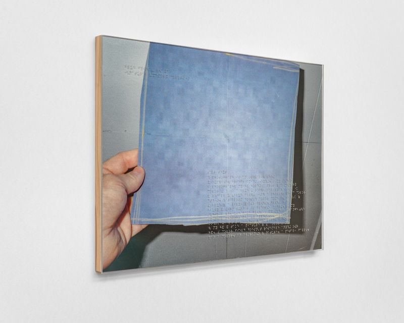
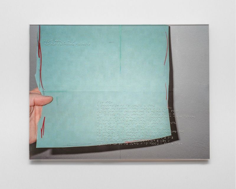
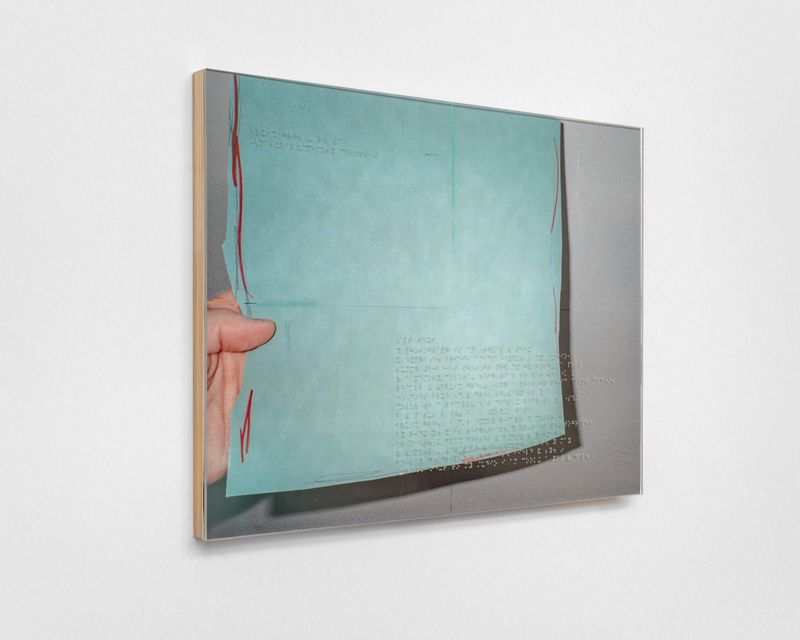
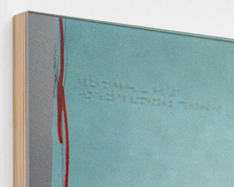
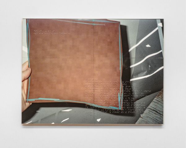
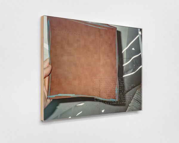
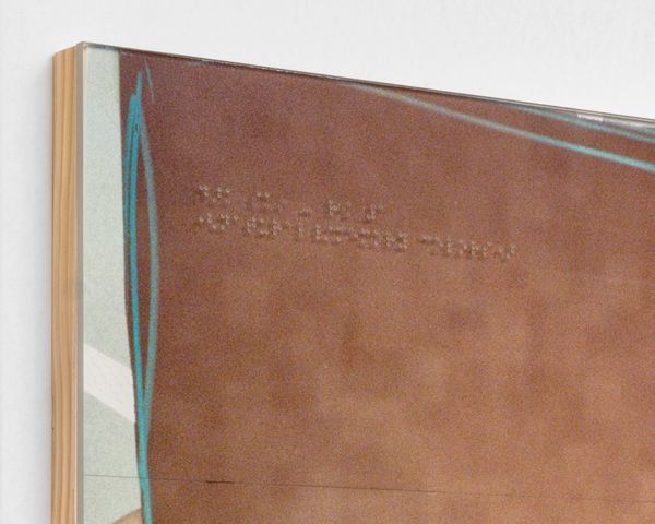
Memory Colors draws from photographic color card “memory colors”, hues people instinctively recognize, to examine calibration and perception. Near-monochrome panels w/ Braille described media reflect ecological instability and a shifting sense of reality.
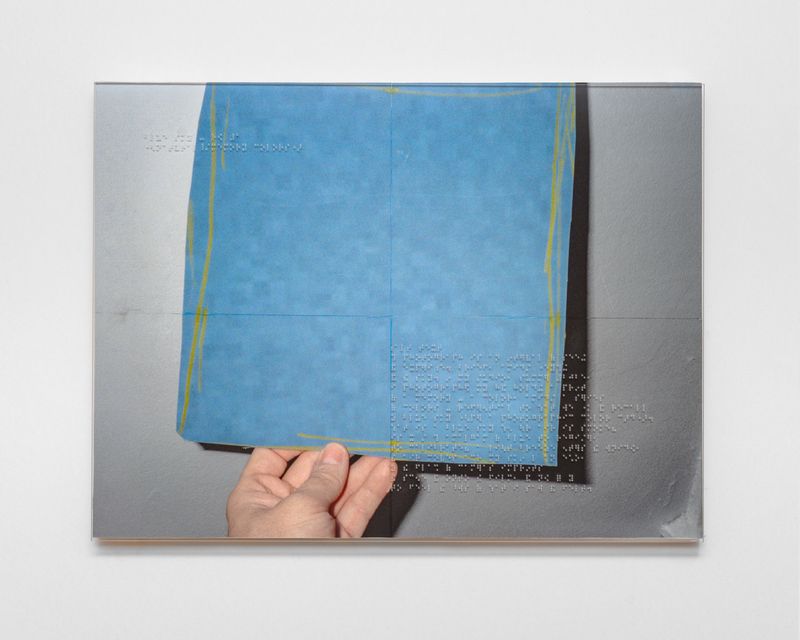
Memory Colors draws from the standardized “memory colors” found on photographic color cards — hues such as dark skin, light skin, blue sky, foliage, blue flower, and bluish green that have long been used to calibrate exposure and color balance. These tones are designed to anchor images to a shared visual reality.
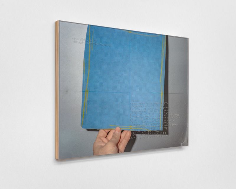
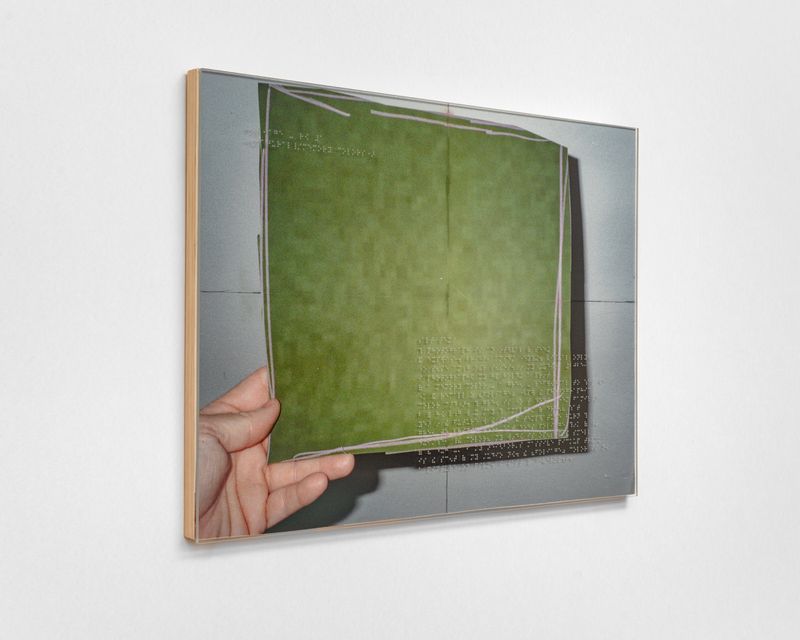
In this series, each color is isolated and rendered as a near-monochromatic photographic panel derived from the top row of the color card. Preserving the card’s sequencing logic maintains photography’s internal calibration structure, even as the work questions whether these reference points remain stable. As ecological instability alters landscapes and atmospheric conditions, the colors historically used to verify realism begin to feel provisional.
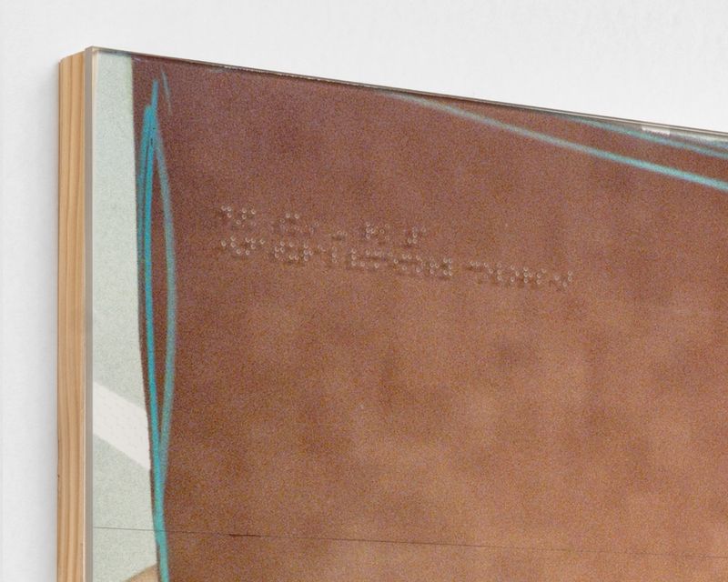
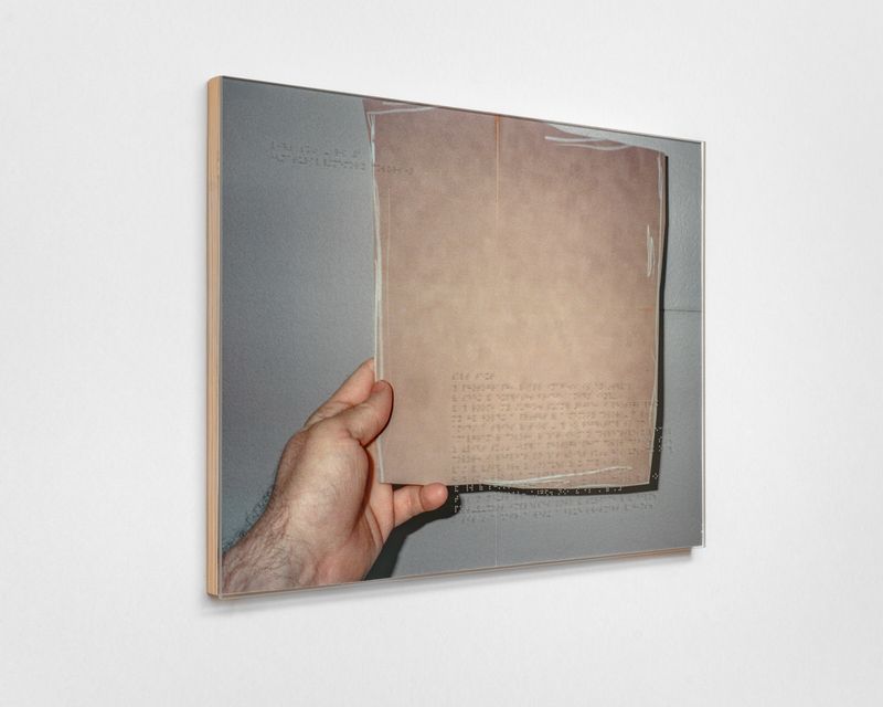
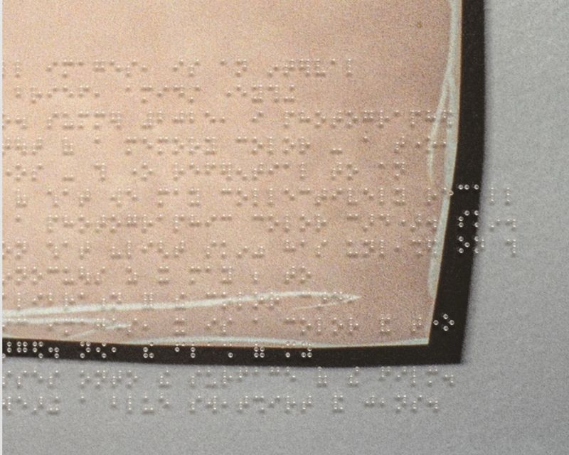
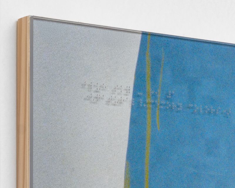
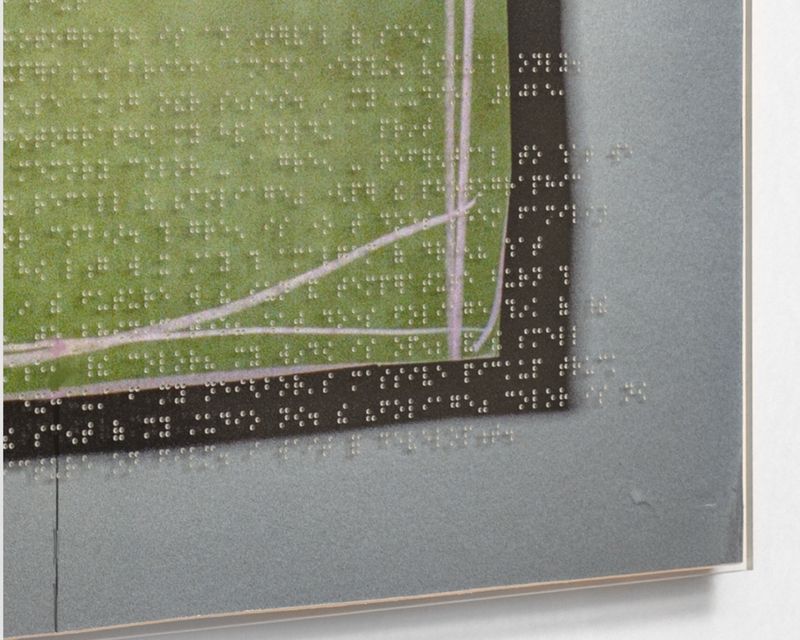
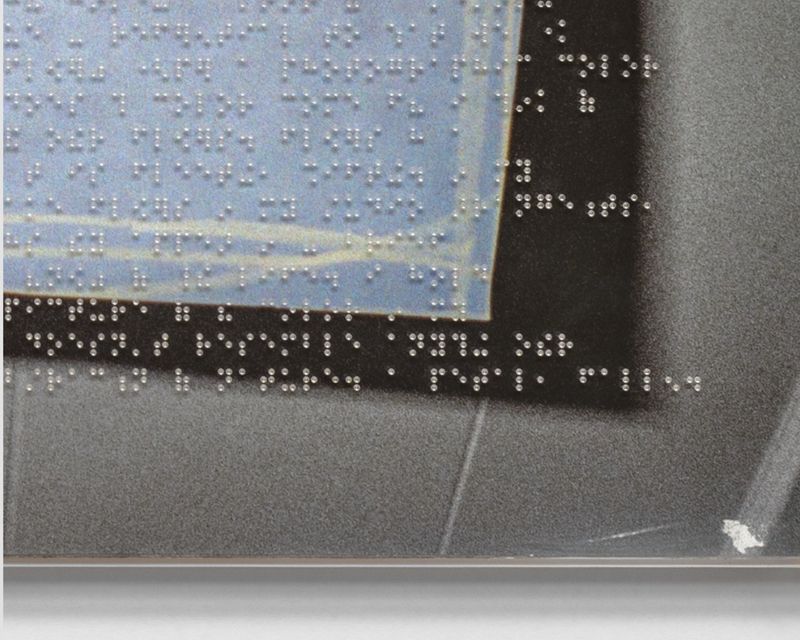
Each panel incorporates Braille inscribed into non-glare acrylic glazing. The Braille functions as described media rather than translation, recording sensory and situational conditions surrounding the photograph’s making. This concurrent haptic layer expands the photographic field beyond vision alone, introducing touch, duration, and embodied perception.
Presented as photographic objects, the works operate between image and index, calibration and memory, optical surface and tactile inscription — reflecting on how photography attempts to anchor the world even as the conditions it references continue to shift.