Photobook Review: Better In The Dark Than His Rider by Francesco Merlini

-
Published12 Sep 2023
-
Author
- Topics Photobooks
Published with Départ Pour l’Image, Merlini’s latest book works as dreams do, and makes you question what design in photography can be.
You’re dreaming. You enter a room and walk through it. Suddenly, that room becomes another room. A place you used to know, or maybe not. Everything continuously transforms into something else, but you aren’t bothered. All is new and oddly familiar at the same time.
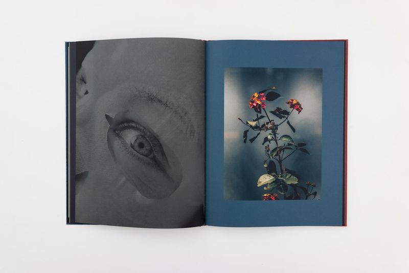
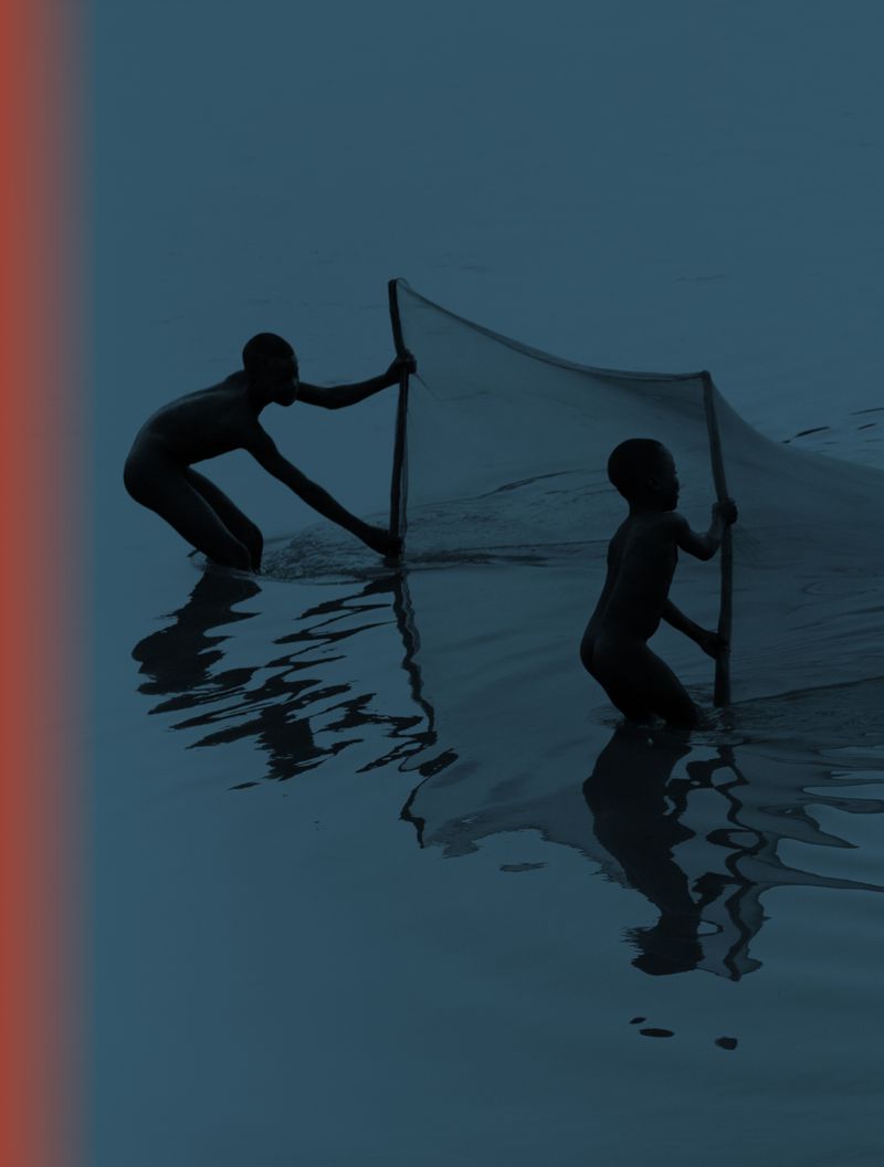
The images in Better In The Dark Than His Rider come from Francesco Merlini’s decennial archive of scattered photographs, which surprisingly share a common visual thread: many of them recall the sense of sight. They directly refer to the anatomy of the eye, or to alterations in its functioning; their narrative is a dreamlike one. More specifically, as Merlini explains, “they come to shape a story of hypnagogic hallucinations: those not-so-frequent lucid dreams that allow for a certain control, as one acknowledges they are dreaming”.
Dreams have logics of their own, and images in a book do too. There are conventions, rules we are used to play by: every image projects something onto the previous and the following one. They overlay with one another in our minds, and pieces of a story come together. We come to fill gaps with meaning, and give consequentiality to things seemingly unrelated. Dreams aren’t that different - things you’ve seen during the day come together and merge in unpredictable, at times absurd ways. Better In The Dark Than His Rider borrows from the logic of dreams, and makes it a design method. “We were trying to find a way to bring the irrational dynamics of dreams to the functioning of the book”, Merlini says, “to the way people would go through it, and stay in it”.
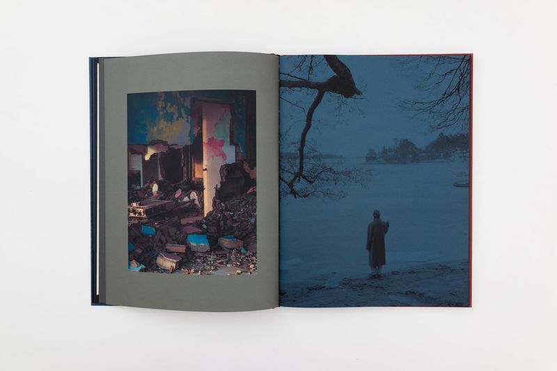
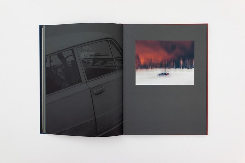
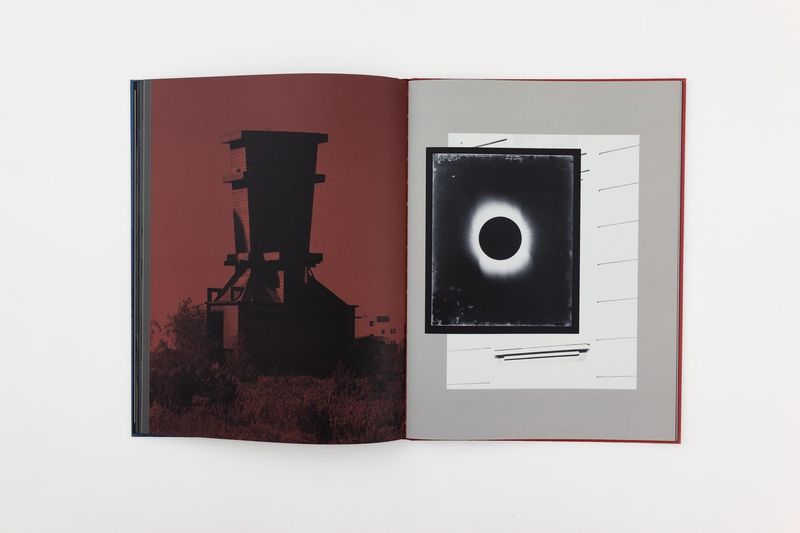
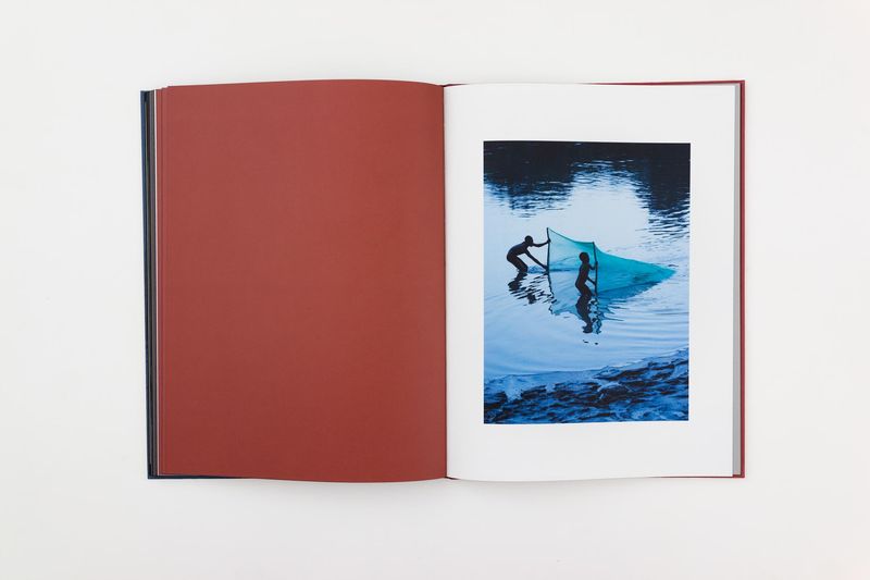
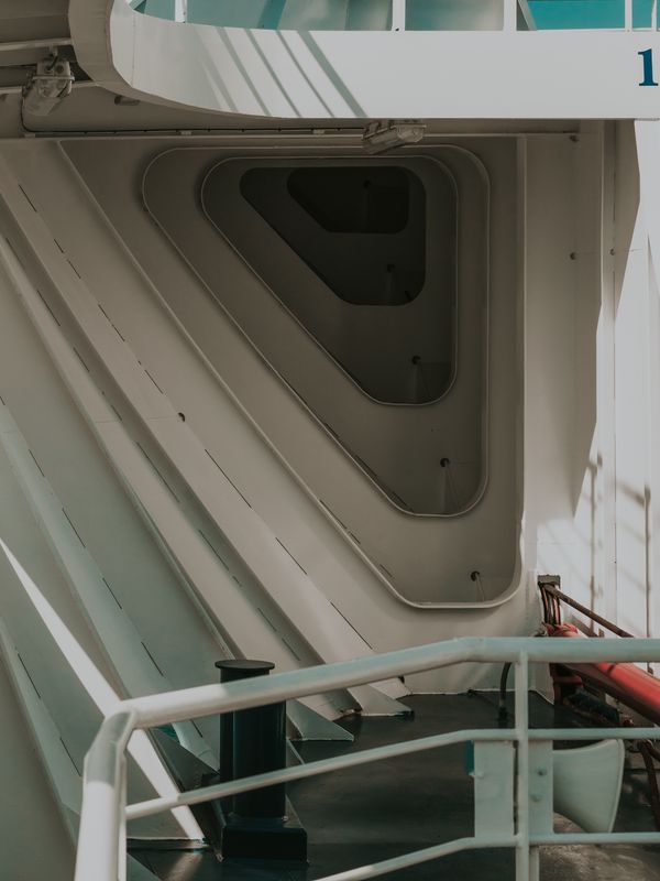
Just as in dreams, one navigates Merlini’s book looking for signs and for connections. Some images are repeated multiple times, like subtle landmarks through an unsettling path. Just as they do in a dream, scenarios change constantly. Night turns into day. Industrial, seemingly abandoned buildings become open-air, natural sites. Flamingos become ducks. The sequence is filled with spirals, tubes and holes: everything suggests constant transition. “When sequencing”, Merlini explains, “we defined a structure with fundamental steps, which marked slight changes of register in our narrative. The book starts with these more figurative associations with the physical shapes of our organs of sight, until the main narrative about lucid dreaming comes. Eventually, the last pages lead you to pure dreaming - there where you let go of all control”.
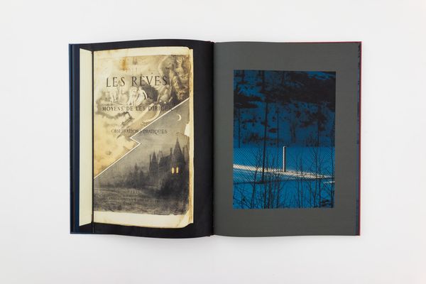
A dream happens with your eyes closed, eyelids marking a stark separation from anything outside. In Merlini’s book, ever-present colored backgrounds do the job, isolating images into a context of their own. The book’s pages aren’t white: a thought-out color palette, imperceptibly shifting from blue to red, from purple to grey, encapsulates each image. “Départ Pour l’Image publisher Luca Reffo is a painting teacher, and has an incredible feel for colour. He spent five months with papers swatches in his hands”, Merlini recalls, “looking at how they would communicate with each image. Without his sensitivity, it would have been impossible to reach this outcome”. “The image-color relationship is so tight you might even think they couldn’t exist without one another”, Merlini says, “and this is exactly what we wanted to get. It wasn’t just about finding the right background for each image: it was about sequencing color just as we sequenced photographs”.
Looking at Better In The Dark Than His Rider, one almost forgets how the pages of a book are conventionally white. When a photo on a white background suddenly appears, something odd happens: that white is unmistakably a color, too. As simple as this might seem, it actually states something crucial about publishing: there are no neutral choices you can take, and a book is no transparent box for some piece of work to be carried around. Following this thinking, Better In The Dark Than His Rider really was designed as a whole: “Images didn’t come before sequencing, and sequencing did not come before design: all was done in parallel. The photographs and the object couldn’t be separate identities that might find contact at some point: they had to completely rely upon one another. We wanted to make something similar to listening to an album, or watching a movie. Something that wasn’t bound to the individual quality of one image, but that worked as a single trip”.
Merlini’s photographs shaped the book as much as the book shaped the photographs. “This project was born inextricably with publishers Francesca Todde and Luca Reffo, it’s a photographic work that wouldn’t exist without this publication”. “As they manifested an interest in my archive”, he adds, “I was intrigued but kind of worried, too. I have often seen books where series of very disconnected images are bound together, with a text that means everything and nothing at the same time. I didn't want to do anything that might look like that. But as we started analyzing this archive of hundreds and hundreds of images together, we saw that a story was there, and it was very clear. It had something to do with the way I photograph - Francesca and Luca often say I take pictures as if I were a stray dog, or a drifter, wandering with no specific aim”.
At the beginning of a photographer’s career comes a point when one realizes their job isn’t taking nice pictures - it’s shaping a concept, crafting a story, designing a narrative. A crucial step in growing, it's something Merlini carefully teaches to his students in photography. But there's something you don't usually mention when working in a class. What happens when you let go of spontaneity? When those “pictures in a drawer” become some awkward, frustrating material? “The photographic environment can be stiff”, Merlini says. “Today, if I’m not working on a project, it isn’t even likely that I bring my camera around. And I must say that working in the opposite direction for this book has been liberating”.
The title, Better In The Dark Than His Rider, comes from an optics manual. Originally referring to the supremacy of a horse’s night vision compared to a human’s, here its meaning shares something, Merlini says, “with the state of abandonment one needs in order to access the dream world”. “Though” - he adds - for me there’s something more to it. It’s about a photographer’s need to shoot relying on, and trusting, a machine. Letting go of thinking, letting go of any control over the narrative. Planning is important, but it can kill that amazement - and that is something I can’t risk losing”.
--------------
Better In The Dark Than His Rider is published by Départ Pour L'Image
23,5x31 cm
Hard cover with embossing
Offset UV
80 pages
Paper:
Munken Lynx Rough 150 g/m²
Fedrigoni Sirio Nero 140 g/m²
Wibalin Natural Petal
Printed in Italy by Longo spa
First edition of 1000 copies
ISBN 978 88 944622 8 9
“Livre du mois” September 2023
Fontation Henri Cartier-Bresson
--------------
All photos © Francesco Merlini
--------------
Francesco Merlini (b.1988) was born in Aosta and he’s based in Milan. In 2016 he was selected by the British Journal of Photography in order to be part of The Talent Issue: Ones to Watch and in 2020 Francesco was shortlisted for the Prix HSBC pour la Photographie. In 2021 he was one of the nominees for the Leica Oskar Barnack Award and in 2023 he was shortlisted at the Sony World Photography Awards. His pictures have been published on magazines and newspapers worldwide including Washington Post, Financial Times, Le Monde and many others while his projects have been featured on renowned photography platforms as American Suburb X and Time Lightbox. Francesco’s work has been exhibited worldwide in solo and collective shows. Francesco's last book Better in the Dark than His Rider has been published in 2023 by Depart Pour l'Image. In 2021 he released The Flood published by Void. In parallel with his authorial path, in the last ten years Francesco has coordinated the international collective Prospekt, taking on the role of photo editor and curator.
Camilla Marrese (b.1998) is a photographer and designer based between Italy and The Netherlands, graduated from MA Information Design at Design Academy Eindhoven (NL). Her practice intersects documentary photography, design for publishing and writing, aiming for the expression and visual articulation of complex issues.